PREREQUISITE
Product UI abstraction
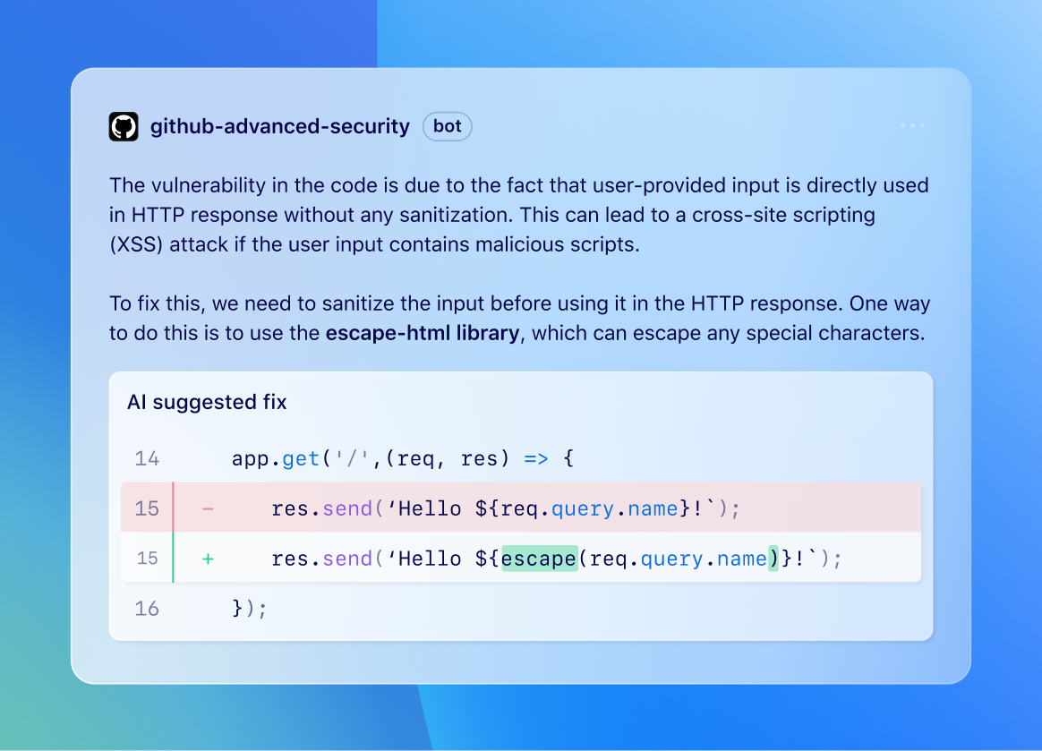
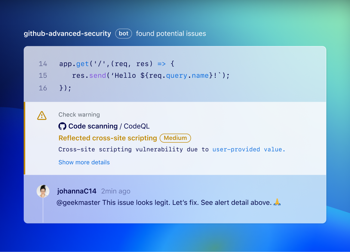
Before rendering a stylized UI, it’s critical to understand your story and create hierarchy. This process is successful when designers identify their primary focal point, the secondary UI elements, and reduce any other unnecessary noise before following the below instructions.
STEP 1
Select a background wallpaper to act as your foundation
Guidance
- Use an appropriate wallpaper from our Brand Asset library that matches the brand pillar of the context.
- The product’s UI should be the main focus. Wallpaper shouldn’t be overly complex or distract from it.
- Reduce noise further, by blurring, cropping or zooming into the wallpaper
STEP 2
Establish focus by defining your layer hierarchy (3 max)
3 layers
Create no more than three layers of hierarchy
2 layers
Tip: use only primary and tertiary
Guidance
- We draw attention to the most crucial UI, using three distinct layers of hierarchy.
- Each layer has their own unique opacity.
- The primary layer, is the most important and most opaque layer.
- The secondary layer, varying from 70-90% opacity is optional and provides necessary context for the primary layer.
- The tertiary layer, with 60-90% opacity, typically serves as the context-providing container for the page, window, or experience.
- To maintain focus, remove non-essential elements such as unnecessary borders, scrollbars, footers, code, and competing buttons or links.
- Maintain the product’s UI consistency and recognizability. You can adjust layer positions for added focus, but avoid major composition changes.
Application
Examples


STEP 3
Determine a global light source
Top Left
Recommended for River and smaller Bento
Top center
For larger UIs like River Breakouts and Heroes
Guidance
- Lighting should mirror real-world physics. It should subtly boost, not overpower, the design.
- Every element should follow a single global light source, either top-left or top-center.
- Avoid changing the direction of your light source. However, there is an exception for the Hero. For example, you can switch from a top-center global light source in the Hero, to a top-left source for all other images on the rest of the page.
- Background wallpaper isn’t a light source; the UI shouldn’t respond to its lighting but can reflect its colors, as discussed in Step 7.
Application
STEP 4
Apply lighting to layers based on material
Frosted glass material
We use a frosted glass material for our light UI to enhance its visibility against backgrounds. Frosted glass is made by sandblasting or acid etching clear sheet glass. This process creates a pitted surface on one side of the glass pane, which scatters the light passing through it. As a result, it blurs images while still allowing light transmission. Despite varying transparency among layers, each should diffuse light similarly.
Frosted glass 3d texture
Real frosted glass
- Radial Fill: Use a radial fill to emulate the sun’s circular shape (a global light source). The fill should be at its brightest intensity near the actual light source, then progressively scatter and diffuse as it extends towards the far end.
- The fill should never be completely transparent and should be visible against the wallpaper. The max opacity varies per layer, so adjust to maintain layer hierarchy.
- Ensure that the direction of the gradients are consistent across all layers when applying radial fills.
- Background blur: Add 150px background blur to reduce wallpaper noise that may obstruct UI.
Application
STEP 5
Apply specular highlights
Top Left
Highlight strikes at the top left, then fades towards bottom right
Top center
Highlights hit the top first, and then fade at the bottom
Guidance
- Highlights appear nearest to the global light source.
- The intensity of these highlights varies based on the layer’s opacity. They are most noticeable on tertiary layers and barely visible on primary layers.
- Apply a 1px radial gradient stroke - Use a radial gradient stroke that fades to 0% opacity at the UI edges to mimic the global light source. Top opacity can range from 60% to 80%, based on layer opacity.
- Ensure that the direction of the gradients are consistent across all layers. They should roughly match the radial fills of the layer.
- Inner glow: Apply an inner glow with 40-60% opacity and 40-60% blur to simulate the material’s soft diffused nature. Ensure it is offset to match the visible edges of the radial stroke.
Application
STEP 6
Apply shadows and border-radius to add dimension
3 layers
Box shadows are cast opposite to the top-left light source
2 layers
Box shadows are cast opposite to the top-center light source.
Guidance
- Each light source we cast also creates a shadow at its opposite end.
- Layers should be closely positioned to each other. Consequently, shadows will appear sharper and slightly offset to denote the distance between layers.
- Box-shadows: Apply a 1-3px offset to all box-shadows on both y-and x-axes, include a slight 1-3px blur, and soften by reducing opacity to under 10%.
- Border-radius: Apply nested border-radius to layers for hierarchy. Typically, primary layers use 4px, secondary 8px, and tertiary 16px to align with Primer-Brand standards.
Application
STEP 7
Add color temperature to elements and ensure text legibility
Guidance
- Content in product UI tells a story and is often read like marketing copy. Ensure all important text is legible and passes contrast ratios to convey the desired story.
- Color Temperature: Light reflects color. For instance, in a purple room, any light cast will give objects a purple hue. Adjust the UI and text color using the Primer Brand palette to subtly match the wallpaper’s dominant hue. This is optional for primary layer text.
- Legibility: Use standard 16px body copy size where possible and ensure colors pass contrast ratios.
- Formatting code: Syntax highlighting should be applied based on the source code. Code snippet length should be tailored to the context of the story told and must also pass contrast ratios.
Application
Example
Slight purple temperature applied to text
STEP 8
Polish and revise details to work for the UI story
Guidance
- The above parameters may not fit all scenarios and should be used as a guide.
- Crop, zoom or offset layers to balance objects and highlight their importance.
- When incorporating multiple images into an experience, ensure that the lighting, opacity between layers, hierarchy, and spacing are consistent across all images.
- Trim down to the essential points needed to convey the demo takeaways. Add or remove details as needed to strengthen the composition.
STEP 9
Make images accessible to assistive technology
Guidance
- Add alt text to all images
- The alt text should describe the image’s content, elements, and their interactions.
- If code or content is presented, consider including it in the ALT text, as it conveys the meaning of the demonstration.
STEP 10
Motion design
Guidance
- Motion is a tool to demo how the UI works
- Before starting animation, it’s highly recommended to storyboard your demos.
- Animate frames in a way that keeps the focus on the most important element at all times.
- If the story requires context from tertiary or secondary layers, don’t start with the primary content. Instead, make the primary content the final focus when motion ends.
- Some users might have ‘prefers-reduced-motion’ turned on. Always have a static image with alt text as backup.