GitHub’s logo represents the brand in corporate environments for easy recognition. It can be presented three ways depending on the context or audience: pictogram and lockup.
The Invertocat
We call our logo pictogram the Invertocat — it represents our mascot, the Octocat. It’s our primary logo, and we use it to represent GitHub on all kinds of surfaces: in the product, for attendees at a GitHub event, subscribers to GitHub emails, or someone reading our help documentation.

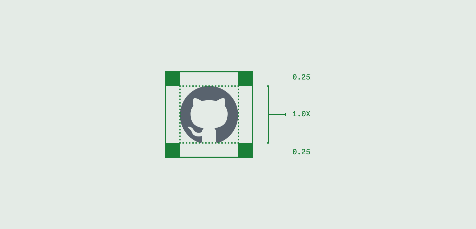
Lockup
We use the lockup, featuring the invertocat and wordmark, in most places. GitHub is always one word with a capitalized G and H. When referring to GitHub the product, company, or service, keep it simple—GitHub.
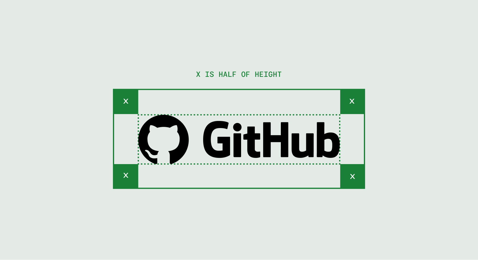
Coloring the logo
The Invertocat and our wordmark should only appear in white, black, or in few cases grey.

Sub-brand logos
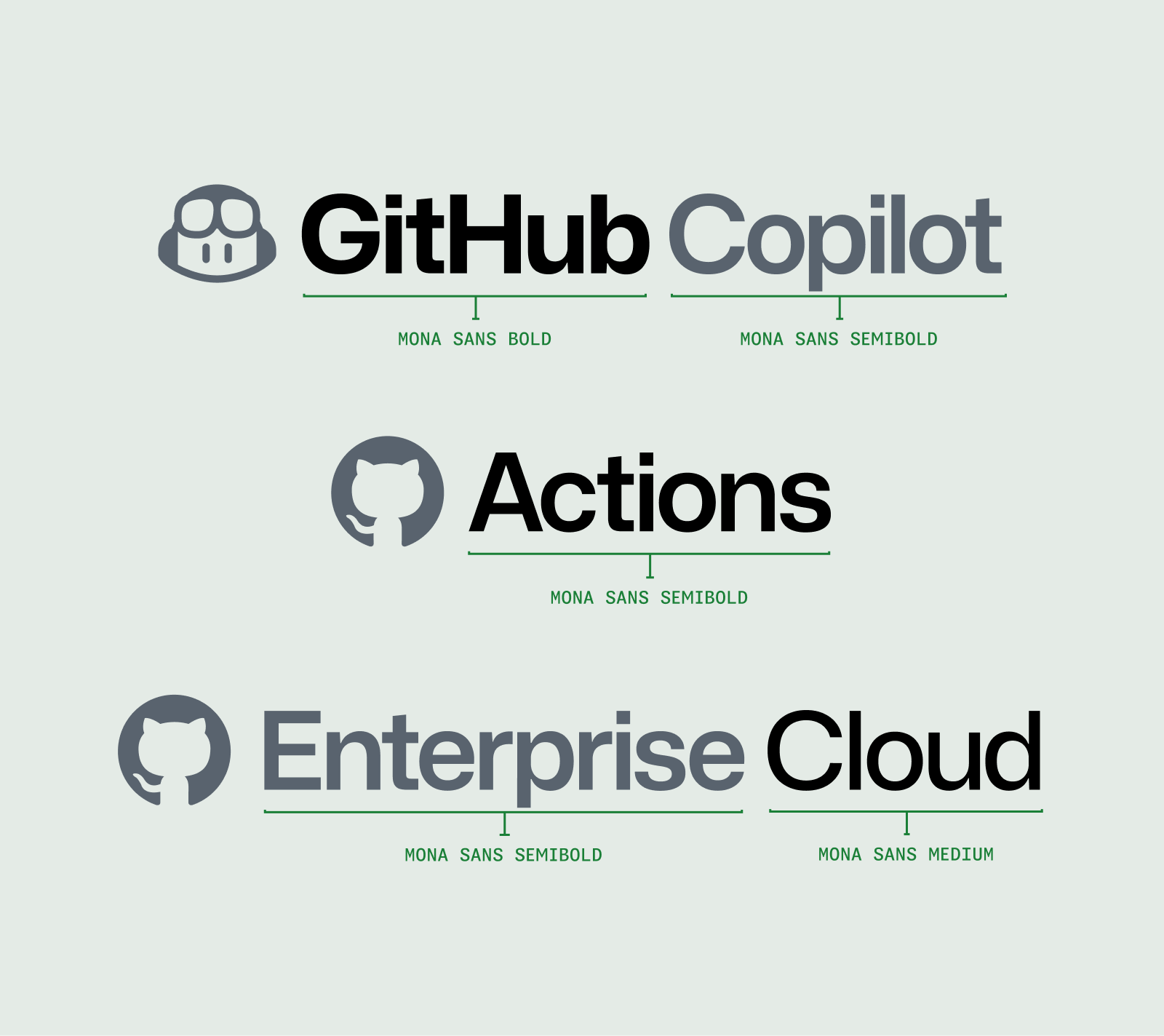
Rarely, individual products, features, or GitHub teams require a custom sub-brand logo. Most sub-brands are created by setting the name in Mona Sans.
Standard sub-brand lockups
To create a standard sub-brand logo lockup, we utilize the following visual hierarchy:
- Set “GitHub” in Mona Sans Bold
- Set the name of the program, feature, or event in Mona Sans Semibold
- Set any addition locations, dates, or details in Mona Sans Medium
Bespoke sub-brand lockups
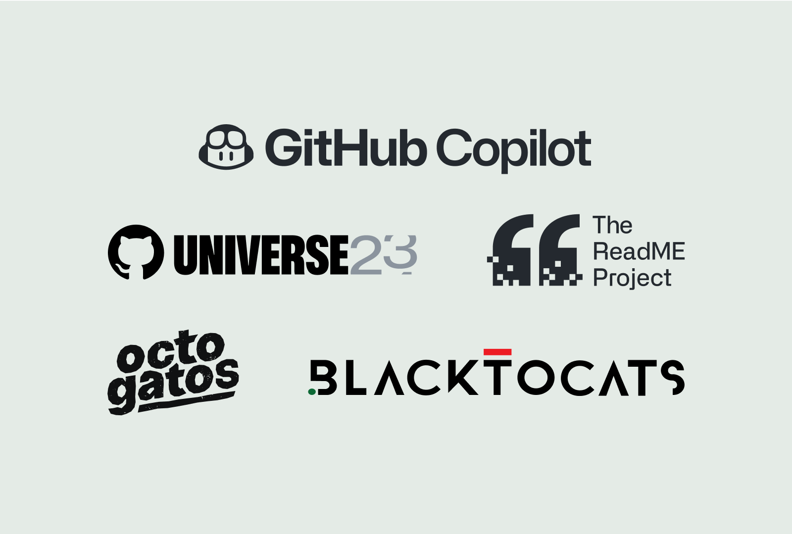
Some initiatives lead by GitHub have bespoke sub-brand logos. Initiatives like the ReadME Project — a large community and publishing initiative lead by GitHub — has an entire brand of its own. Copilot, for instance, is lead by its product icon. When a custom icon is used, the wordmark (“GitHub”) should be implemented as well.
Create an issue in the Brand & Marketing Design repo to discuss whether a custom mark is appropriate for your project.
Co-branding
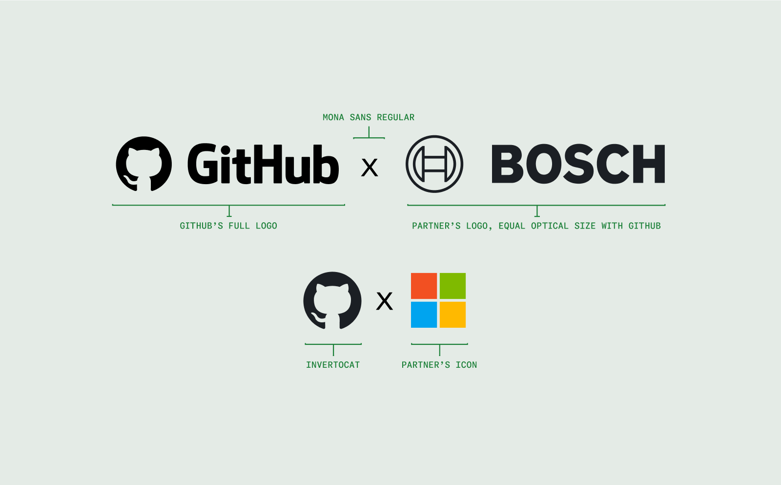
When GitHub has an official partnership with another company, the following visual hierarchy should be maintained in public-facing announcements.
Each logo should be approximately the same size overall with consideration to both width and height while retaining optically centered.
Usage
In short, the GitHub logos represent only GitHub and should not be used to represent you or your projects, products, or company.
Do Use the Invertocat or GitHub logo to direct customers to GitHub.
Do Use our logos in social to link to your GitHub profile or project.
Do Use our logos to advertise that your product has built-in GitHub integration.
Do Use our logos in a blog post or news article about GitHub.
Do Use our logos at the end of a video piece.
Don’t Use our logos for your application or product’s icon.
Don’t Create modified versions of our logos for your own, or your team’s, use.
Don’t Create co-branded logos using the GH wordmark or the Invertocat.
Don’t Change colors or dimensions in our logos, or add your own text or images.
Don’t Name your projects, domains, or products with anything that implies GitHub’s endorsement.
Don’t Use, or sell GitHub logos or artwork without permission.
Common errors
Below are some common errors that should be avoided entirely.
 Don’t use backgrounds that provide insufficient contrast.
 Don’t place the logo over busy backgrounds.
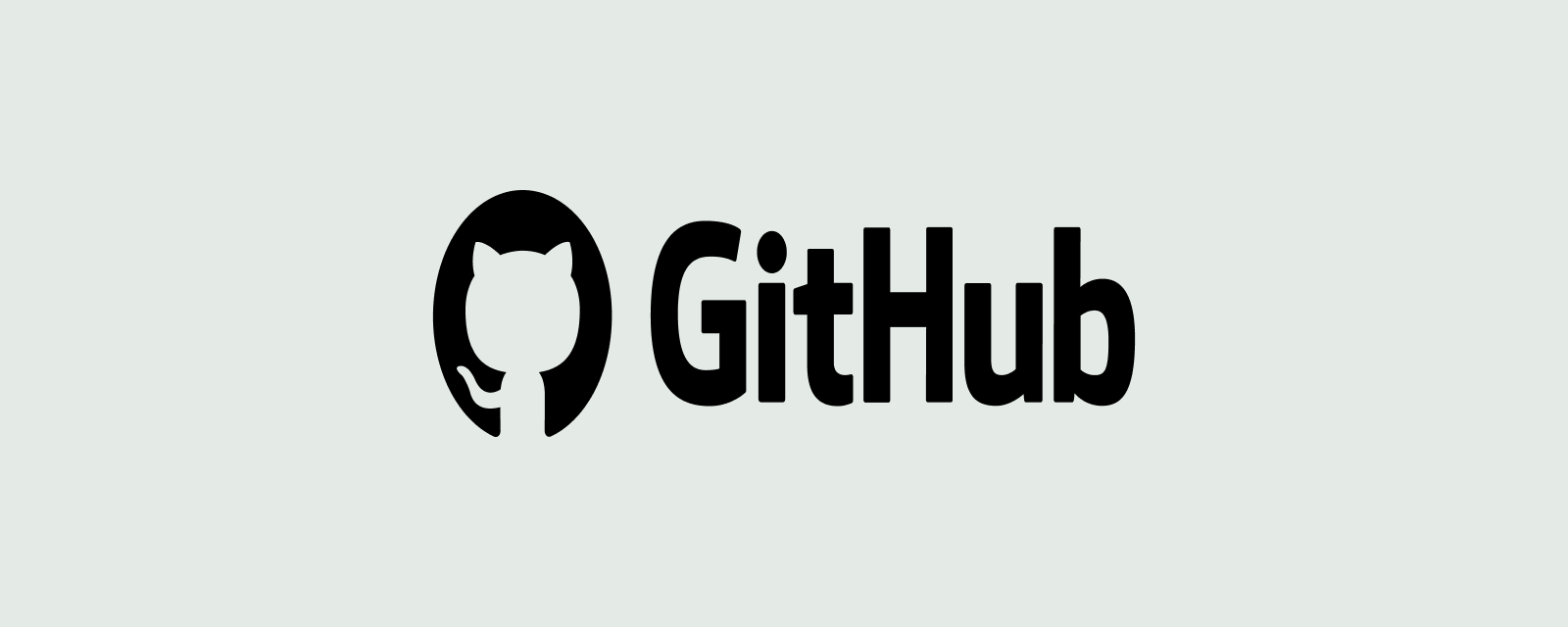 Don’t compress distort, skew, or stretch the logo.
 Don’t alter the lockup in any way.
 Don’t add graphic effects like shadows or gradients.
 Don’t rearrange the elements of the logo.
Deprecated logos
The invertocat with suction cup dots has been retired, and should not be used.
