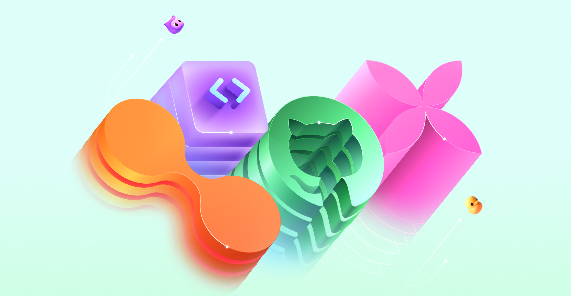
Key art
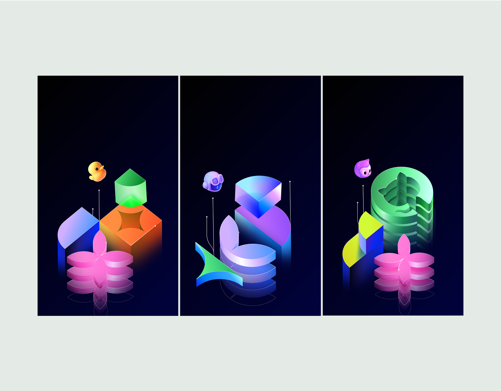
Our art is an ode to all that is—or will be—built with GitHub. A visual language demonstrating progress through iconic, optimistic, future facing monuments. Six shape lockups flex across mascots and colors. Each emphasizing different products or features while speaking more generally about the GitHub universe.
- From dream to reality
- From programming to product
- From people to planet
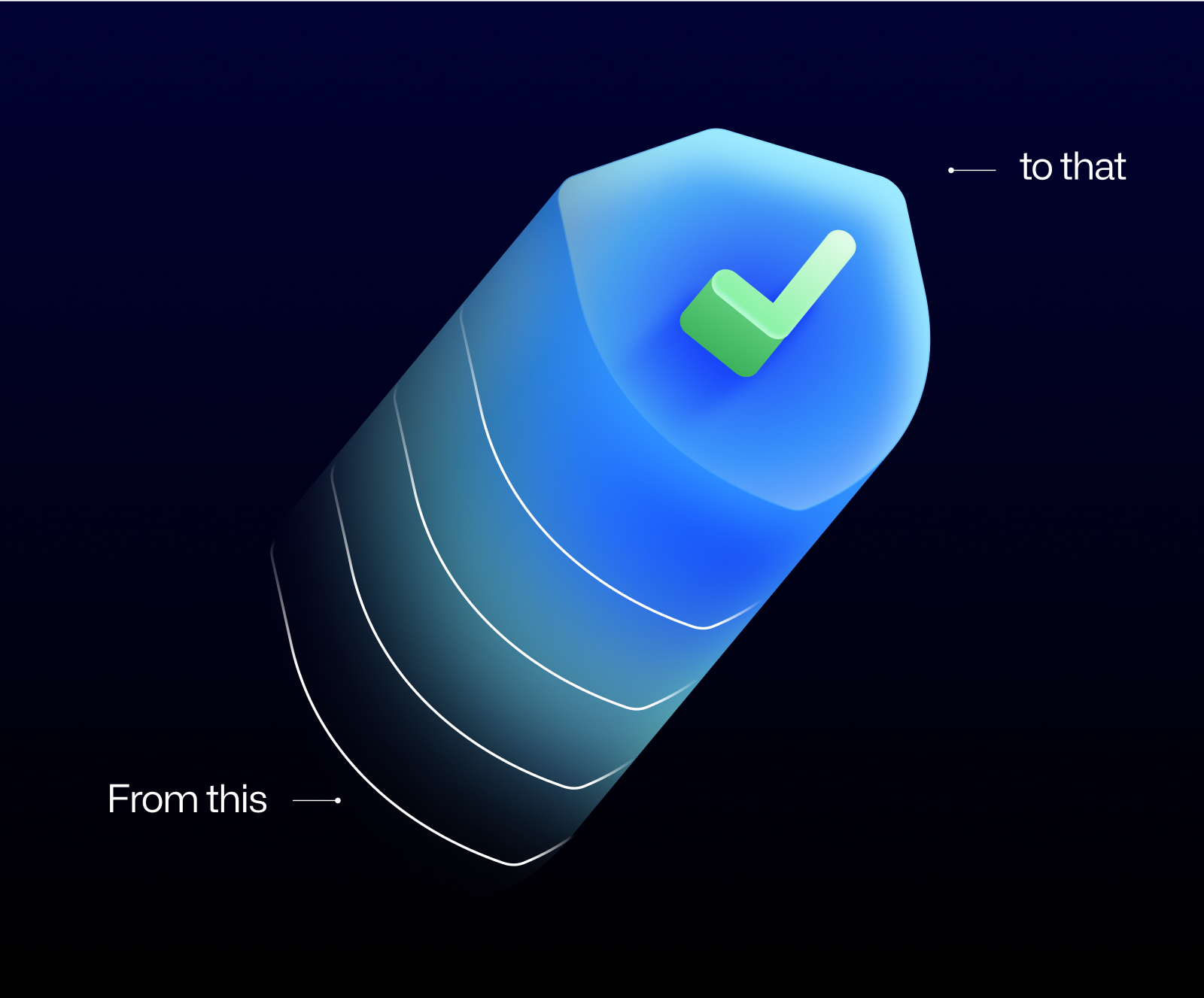
- From this to that
- From this to that
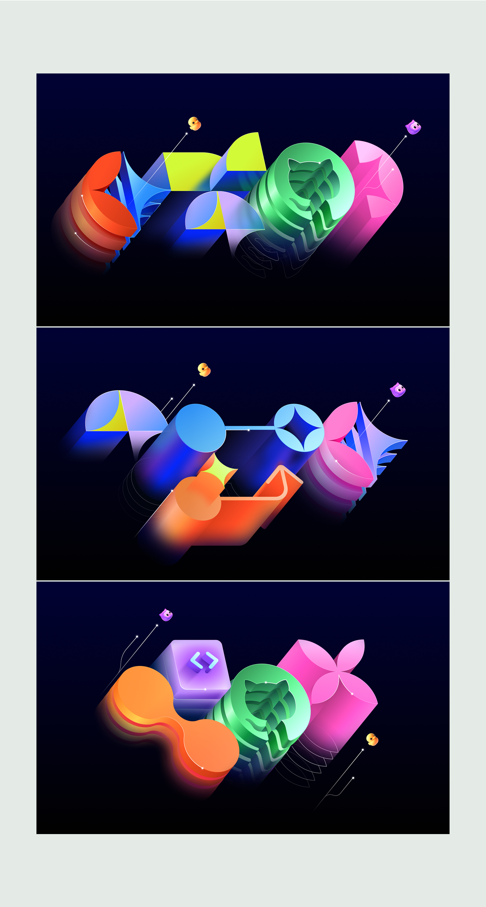
Six shape lockups flex across mascots and colors. Each emphasizing different products or features while speaking more generally about the GitHub universe.
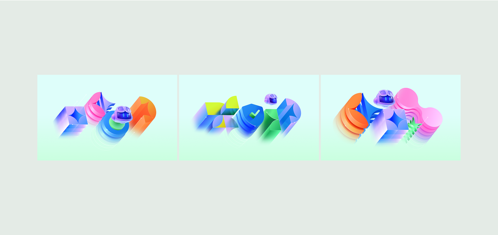
Light mode variants are provided for each.
A complimentary set of vertical key art is also available for social and other assets in a portrait orientation.
Background gradients
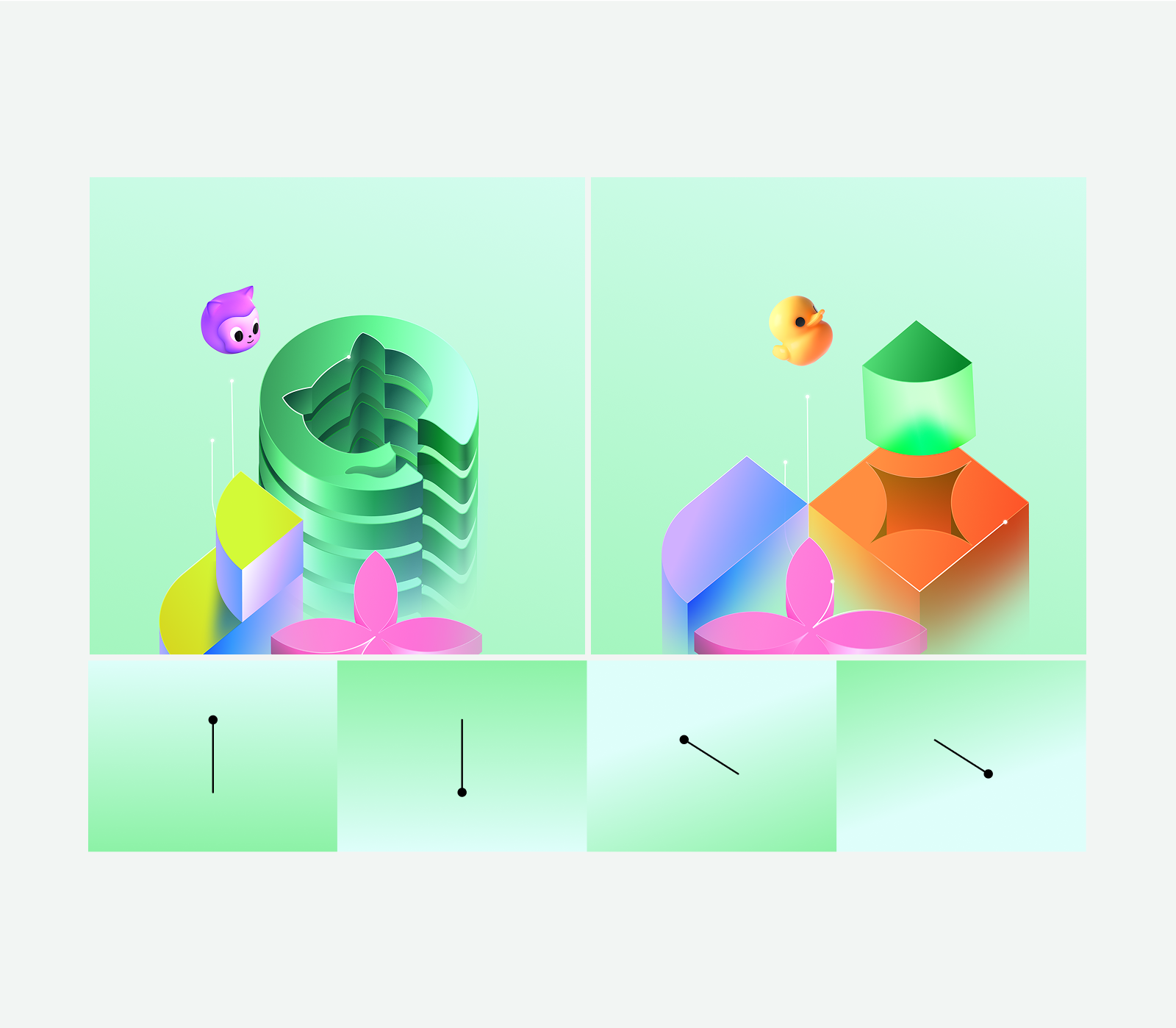
Background gradients have 2 colorways, and 4 directions. These options can be used depending on the composition and in preference of the design. Directions of gradients should be adjusted as needed, but artwork should not be interchanged between the light and dark modes. The artwork was created specifically for each environment.
Light mode
Aa
Green 2
HEX: #8CF2A6
RGB: 191/255/209
CMYK: 30/0/45/0
SPOT: 7487
Aa
Cyan 1
HEX: #DEFEFA
RGB: 222/254/250
CMYK: 13/0/2/0
SPOT: 317
Details
Colors
| Value | Position |
|---|---|
| #8CF2A6 | 0% |
| #DEFEFA | 100% |
CSS
linear-gradient(
  90deg,
  #8CF2A6 0%
  #DEFEFA 100%
)
Dark mode
Aa
Gray 6
HEX: #101411
RGB: 16, 20, 17
CMYK: 20, 0, 15, 92
SPOT: Process Black
Aa
Purple 6
HEX: #000240
RGB: 0,2,64
CMYK: 99,99,0,5
SPOT: 2735 c
Details
Colors
| Value | Position |
|---|---|
| #101411 | 0% |
| #000240 | 80% |
CSS
linear-gradient(
  90deg,
  #101411 0%
  #000240 80%
)
Application
Be selective about what gets the full treatment. If everything is a monument, nothing is a monument. Illustration style and complexity should vary depending on the importance of the asset. The content should help decide if the artwork is meant to be more supportive or attention-grabbing. We lean towards the quieter outline renders, or a balance of both styles to allow other elements (such as text) to stand out.
Main
Use parts of the key art for most applications. Try to keep the visual focused, with three shape colorways at most. You can improve hierarchy by reducing the amount of colors down to one.
Informational
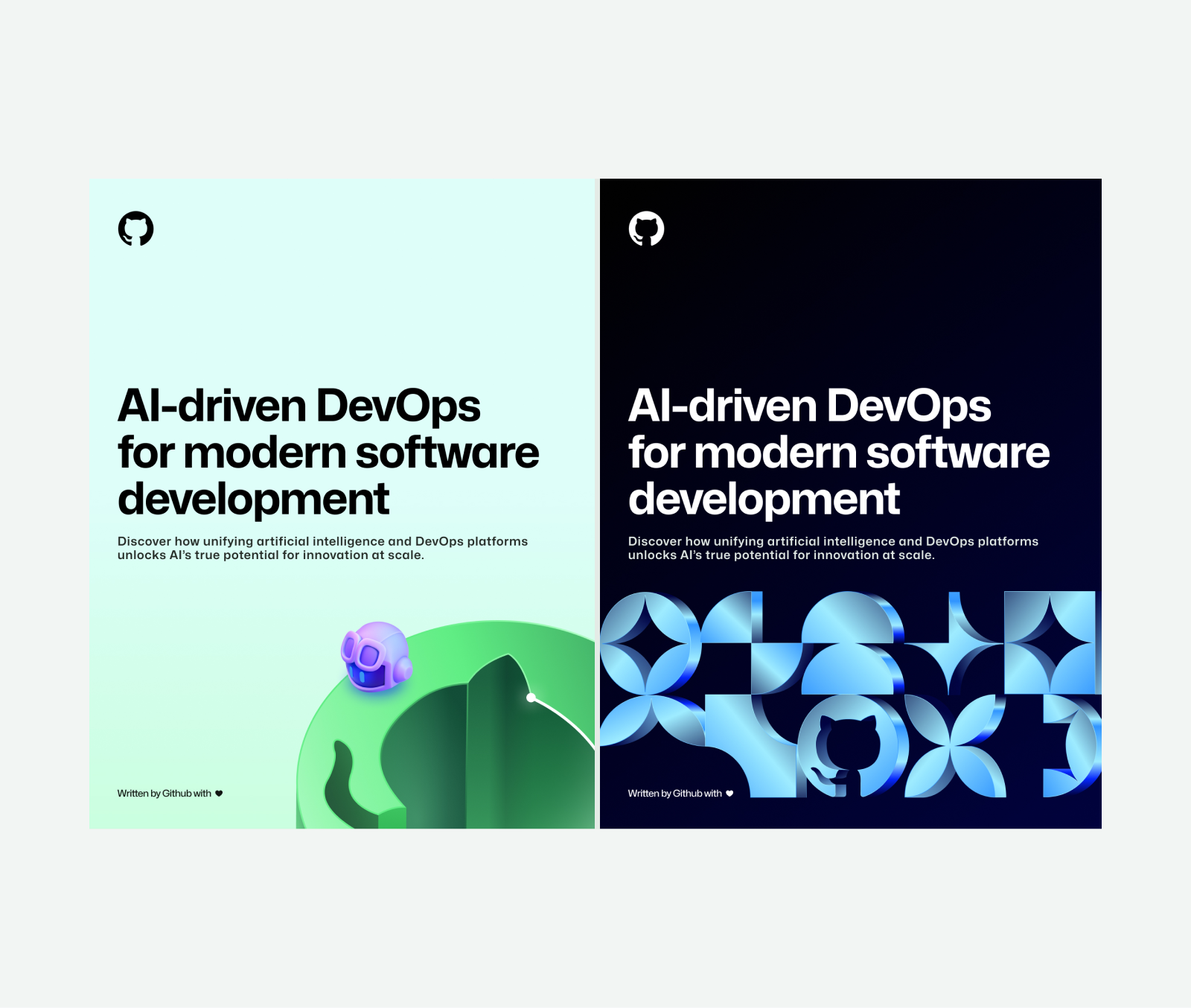
When text is the focal point, use an enlarged detail of a shape to reduce visual noise. Remove Gitlines to further emphasize the text.
