Our color palettes all derive from the Primer library, but are bumped up in saturation for extra vibrancy.
Primary palette
Our primary color palette anchors around green. In most brand applications it should be the key player. We use neutrals, black, and white to ground it in order to create focus and create a technical but uncomplicated feeling.
Aa
Green 1
HEX: #BFFFD1
RGB: 191/255/209
CMYK: 20/0/30/0
SPOT: 7486
Aa
Green 3
HEX: #5FED83
RGB: 95/237/131
CMYK: 43/0/60/0
SPOT: 2268
Aa
Green 4
HEX: #08872B
RGB: 8/135/43
CMYK: 100/0/86/3
SPOT: 347
Aa
Green 5
HEX: #104C35
RGB: 16/76/53
CMYK: 100/0/71/43
SPOT: 342
Some situations are more suited to a monochromatic color strategy. Here are some pairings which could help create contrast, without competing with the text or call to actions.
Secondary palette
The secondary palette helps support expressive moments in our key art. Big brand moment illustration is the only place where all color might be used simultaneously, and even then only very rarely. These supplementary colors originate from the Primer GitHub palette. They present a range of possibilities for a variety of applications, but our iconic GitHub Green should still be the thread that unites them.
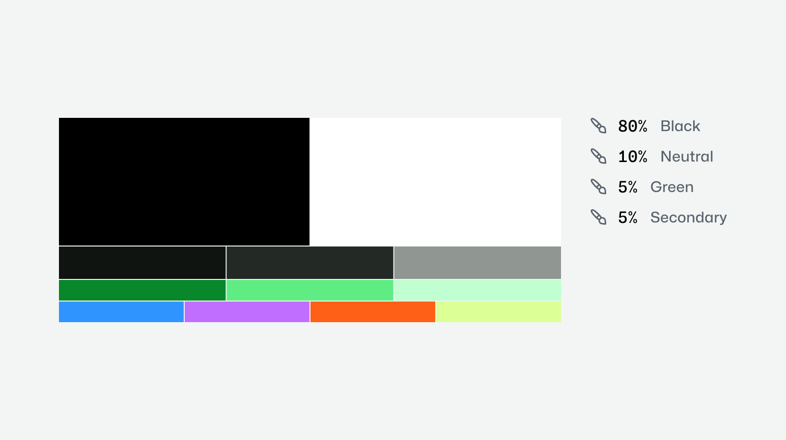
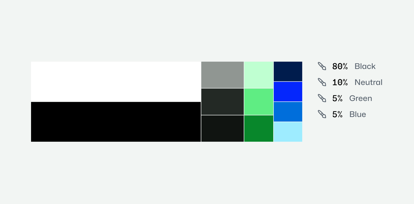
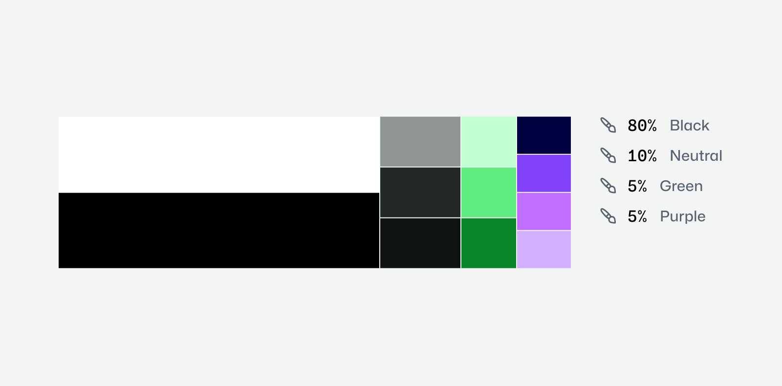
Shows the recommended usage proportions for each brand color.
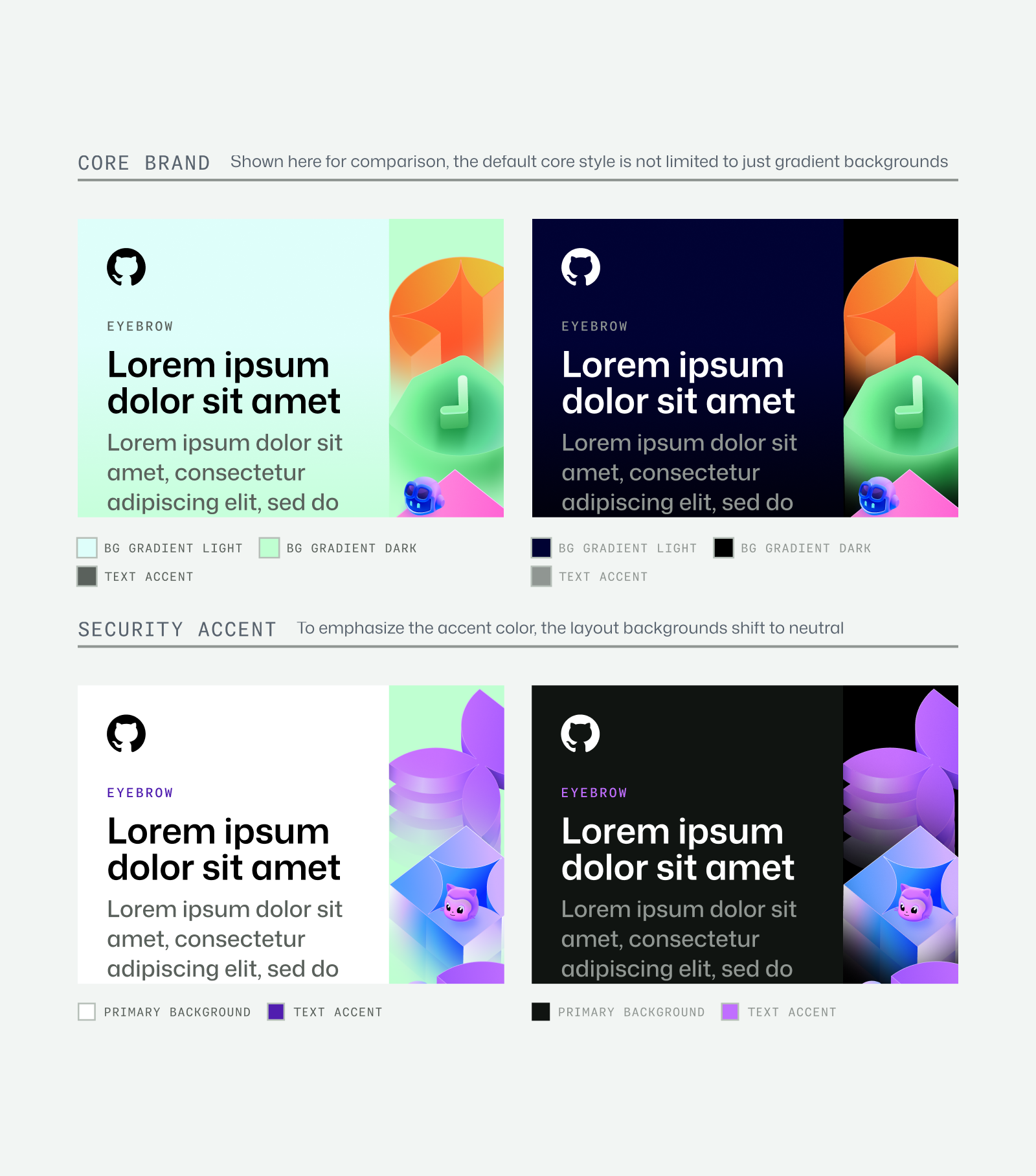
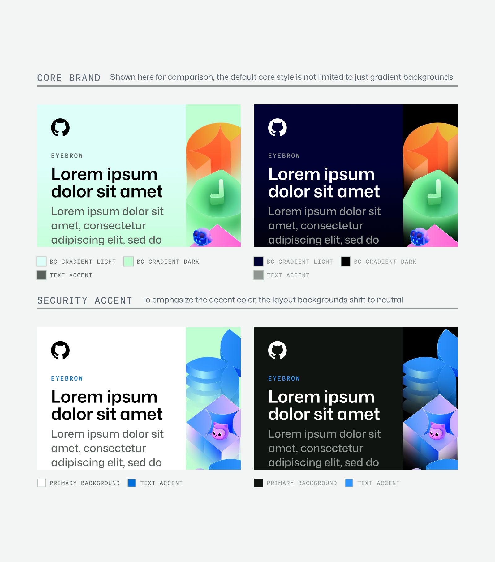
Security Color Palette
We leverage blue to communicate trust, reliability, and protection. Use blue accents for marketing and events focused on security-related features. Use the Secondary palette to support in small moments in key visuals if needed.
Aa
Blue 1
HEX: #9EECFF
RGB: 158/236/255
CMYK: 38/7/0/0
SPOT: 290
Aa
Blue 2
HEX: #3094FF
RGB: 48/148/255
CMYK: 81/42/0/0
SPOT: 279
Aa
Blue 4
HEX: #0527FC
RGB: 5/39/252
CMYK: 98/85/0/1
SPOT: 2935
Aa
Blue 6
HEX: #001C4D
RGB: 0/28/77
CMYK: 100/64/0/70
SPOT: Ref Blue
Although the core brand extends beyond green and neutrals, the Security palette uses stark neutrals for layouts and monochromatic blues in key art. This theme should be used in contexts where security is the primary focus.
Ai Color Palette
We leverage purple to communicate our intelligence and innovation products. Use purple accents for marketing and events focused on Ai features. Use the Secondary palette to support in small moments in key visuals if needed.
Aa
Purple 1
HEX: #D0B0FF
RGB: 208,176,255
CMYK: 21/27/0/0
SPOT: 2635
Aa
Purple 2
HEX: #C06EFF
RGB: 192,110,255
CMYK: 641,55,0,0
SPOT: 528c
Aa
Purple 4
HEX: #501DAF
RGB: 80,29,175
CMYK: 0
SPOT: 2090
Aa
Purple 6
HEX: #000240
RGB: 0,2,64
CMYK: 99,99,0,5
SPOT: 2735
As with the Security palette, the Ai palette focuses the layout colors to stark neutrals, and the key art to monochromatic purple tones. This theme should be used in contexts where Ai is the primary focus.